
Chat with James
Book a free discovery call with our co-founder to see if we’re a good match for your requirements.
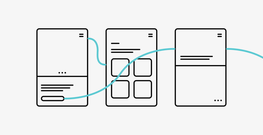
Wireframes: How to review and use them
As a digital product designer, a large part of my everyday work is ideation. Taking the problems our clients are facing, diving into and researching them, and coming up with clever digital products that will solve them and make their users' lives easier.
When we are figuring out how to solve a problem, we sketch down solutions in the shape of wireframes. This stage is used to figure out the initial layout of the content, trying different ideas to solve the problem at hand.
This stage is the perfect time for you as a client to make sure we're on the same page about what the problem is, and how the new tool, app, or website will solve it. This is where you can explore ideas and agree on the base structure of the product at an early stage, where making changes doesn't have too much of an impact on project progression. It prevents time-loss from making changes to an already designed screen later on in the project.
So how do you approach reviewing and using the wireframes you've been presented with? First, let's define what the purpose of wireframes are, and aren't.
What a wireframe is
The purpose of a wireframe is agreeing on:
1. Which content is included
What needs to be written, which assets need to be sourced?
2. The hierarchy of that content
What's most important and should be shown first?
3. How the content is connected
Which elements are interactive, and what happens when you click on those that are?
What a wireframe isn't
The purpose of a wireframe is not agreeing on:
1. Which images, icons and other media to include
But rather what the purpose of including them is, how much space they will take up and where on the page they go.
2. What colour to use for the button in the corner
But rather how attention-grabbing it should be and where it takes you after being clicked.
So, how should you approach reviewing a wireframe?
The easiest way to think of it is from the point of view of the person who you want to ultimately be using your website, app or whatever is being designed. For example; what are they looking to get out of landing on your homepage? Does the wireframe you've been presented with include the most important information so that it's easy to find, or links to other places where they might find it?
The wireframe should answer what the goal is that you've set out for them, and how they should get the information and prompts along the way to reach that goal. Focus on the process the user will go through from opening your website or app to completing what you want them to, whether it is signing up as a member, filling out and submitting a form, or finding out the information they need in order to do something.
Questions to ask
When the design team you're working with presents, or sends you wireframes to sign off, they're doing so to make sure you agree on everything that's been discussed in the earlier stages of the project. This is where the information they've been given by you as a client, and findings from the research done up to this point, come together. It leaves room for discussion, and this is where you can ask the questions that matter most to you.
Keep in mind the focus is on usability rather than aesthetics. Your design team hasn't started worrying about which colours, images and fonts to use yet so neither should you. The final design will and should look very different from the wireframes, just as blueprints look very different from a finished house once it's been built and decorated. Focus on questions like:
- How did the user get here?
Where was the user just before they landed here? How will that affect how they take in this information. Maybe there's some information here that they would have gotten on the previous screen, which can be excluded from this one.
- What is the user looking for?
What would be the number one piece of information the user is searching for on this screen? Is that bit of content prioritised and visible enough?
- Is this part valuable?
Why are we including this? Does it provide anything of value?
- Is the journey natural to the user?
Does it feel like a logical journey through the product? Are the steps in the right order? Is what is here better than how the users currently perform their tasks either in existing digital products or in the physical world?
- What happens next?
What's the call-to-action on the screen? Where do we want the user to go next and how can we get them to go there?
Speak now or forever hold your peace
Well almost; one of the joys of a digital product is that you can update it even when it's live. Making changes at the wireframe stage though will save you time, money and even customers in the long run. The wireframing stage is the perfect opportunity to validate the direction of the project. It helps you spot the gaps and understand the unknowns. This is why investing some time early on in the project will probably save you lots of time at the end of it.
Summary
As a client you can use the wireframing stage to save some time at the later stages of your project. Use wireframes to explore ideas with the design team and make changes early on. The wireframes should answer questions about usability and functionality rather than aesthetics, and explain how your product will solve the problems that your users face.
Let's get started
Chat with James
Book a free discovery call with our co-founder to see if we’re a good match for your requirements.