
Chat with James
Book a free discovery call with our co-founder to see if we’re a good match for your requirements.
Figma interaction tips

When it comes to digital product design, interactive prototypes can really help to fully communicate a designer’s vision for a product. Interaction design is a layer of polish that can be added to products that not only improve the user experience but can also impress clients in a way that static designs can’t.
Figma, the collaborative interface design tool, has a number of fun interaction prototyping tools that allow designers to bring designs visually as close to a final product as possible. By using these in creative ways, we can clearly communicate functionality and add some much-requested “Wow factor” to prototypes.
In this article, we are going to provide some simple examples of different interactions that we use at Inktrap that you can recreate in Figma.
Resizing sections
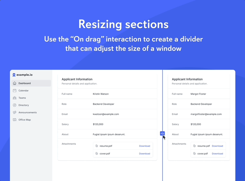
One underused interaction in Figma is “On drag”, which allows interactions to be triggered by a drag movement on a component. This can be used for mocking up scroll bars or swipe to unlock transitions. Another example would be to use it to show how windows could be resized within an application. Smart animate allows for a smooth transition between frames and auto layout can handle the resizing of content. The result is a realistic interaction that can help communicate resizing functionality.
Suggested search
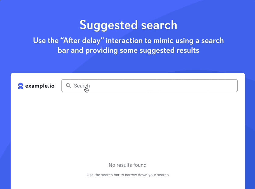
Search functionality is commonplace across most digital experiences. Another layer of functionality that enhances this experience is the development of suggested search results that populate when the user is inputting a term in the search bar. The gold standard of this sort of experience was perfected by the search engine giants Google and is now common in most digital products. This functionality can be demonstrated in Figma by using the “After delay” transition to mimic the user typing a search term. After the first part of the term has been typed out a dropdown can appear with additional suggested terms. This technique adds a layer of realism to prototypes, particularly for digital experiences, that revolve around search and content discovery.
Dynamic button gradient
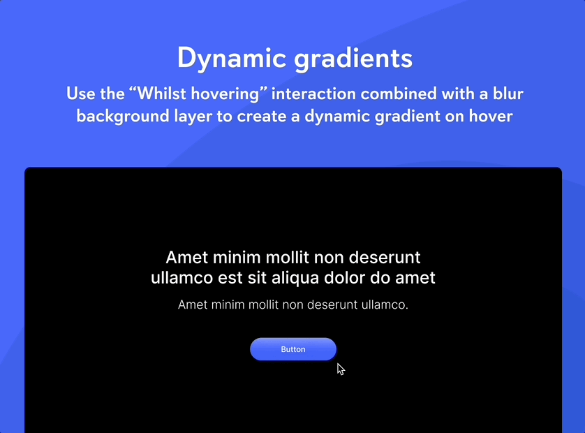
Some interactions that can be demonstrated using Figma focus more on the aesthetic of a design than the technical functionality. This can be incredibly useful as it allows for visual details to be fully communicated to developers, therefore improving the similarity between a design idea and the finished product. One example of how an aesthetic feature could be visualised in Figma is making use of the “While hovering” interaction to create a button with a dynamic gradient. This can be done by setting up a grid of rectangles that change colour on hover. On top of this sits a partially transparent layer with a “Background blur” effect applied, which blurs the colours behind it creating a gradient that changes on hover.
Zoomable maps
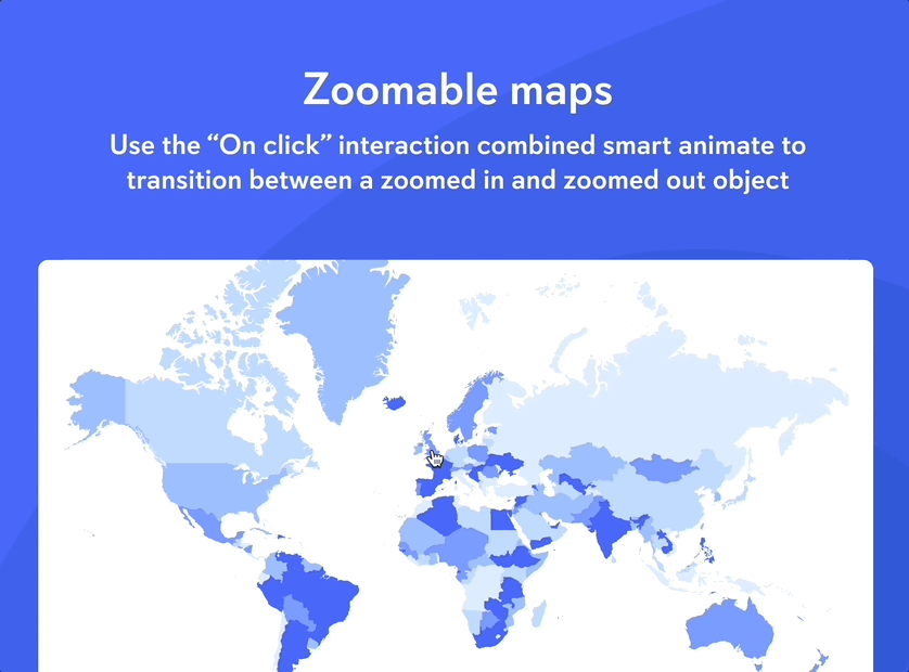
Interactions can also be used to highlight a particular area of a design or provide focus to a section of importance. An example of this would be a map component that zooms into a particular country when clicked. This can be prototyped by using the “On click” transition combined with Smart Animate to transition between a normal and a scaled-up vector map. This can be complemented by introducing other elements that are relevant to a particular country (e.g. statistics or additional data).
In summary, the examples above show how powerful Figma is when used for designing and prototyping interactive user interfaces. With its features, you can create realistic prototypes of interactions that clearly communicate design details to development teams. At Inktrap we consider including interactions in our high-resolution prototypes as an important part of our design process. If you feel like your digital product could benefit from some additional interaction to improve the user experience please get in touch.
Let's get started
Chat with James
Book a free discovery call with our co-founder to see if we’re a good match for your requirements.